


Current Theme Song (aka what's playing on my ipod right now): Vilse i Betlandet (Lost in the Sugar Beet Field) by Väsen.
There is a book (a fantasy book, which makes me squee out in all kinds of ways) that I have been hearing a lot about lately, namely saying it is utterly fantastic. And with a Russia-mirrored bitter cold setting, thus taking us far away from the typical medieval Western fantasy trope, you know I am going to be all over this.
It is Shadow and Bone by Leigh Bardugo.
And ever since hearing of Dreamworks acquisition (go Leigh!) to turn it into a film, I've been eyeing my own unread copy with intense interest again.
So, as I was perusing the internet in all glorious things related to this book, I came across three different covers. And so of course, I started analyzing them together. Because I guess it is a hobby of mine.
Cover A (US)

On first glance it seems like a basic cover, but the allusions to Russia are unmistakable and the strongest out of all the three covers. This is actually one of the biggest selling points for me, because it tells me this is not the typical fantasy I'm used to, and anything different has the potential be very good indeed. The color palette were masterfully done and chosen. Nothing clashes and everything feels like a cohesive whole. The cracked texture could either be for a worn look or to mimic ice, and they are both great stylistic choices.

I keep seeing images of a white stag in fanart, so I am pretty darn sure it is important to the story. And look! Here are white antlers here for us.

And notice the black swirls along with the typography, a bit reminiscent of smoke. Black and white. Shadow and Bone. I see what you're doing here. Tricksy graphic designers. :) Also, the dark ribbon/shadows at the bottom of the book feel like something is rising up, reaching or following them, which imperceptibly adds a taste of foreboding that unless you are looking, you might not even consciously see at all. Overall, this one is my favorite.
Cover B (UK. Notice the title change)

I love the gold border around the cover. It is quiet (it doesn't really attract attention to itself) and it frames Alina well. And did you catch the allusion to Russia woven in throughout? It took me a second to realize it, even staring at it.

Yet I could find no place where a white stag could be hidden.
I really like her cloak. Purely personal, but hey, it drew me in and that is exactly the effect they want. I also love how there are blurred branches in front of her, giving both depth to the image and also an ominous feeling that is matched by her posture and expression. Just what exactly is making her turn so?

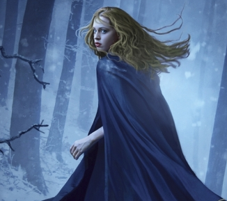
Her expression is not my favorite though.
The snow works to great effect in the cover, as well as the stretching of the forest to a place we can't see. Ominous. And did you notice the twilight feel to the cover? Pair that with the UK title? Ooooooooo…. :)
I will say that the logline (the little hook they put on book covers sometimes to draw you in) does nothing for me. The UK version is the only one that has one and I am glad my copy does not have it. It would have actually been a turn off for me. It is so dramatic and has been done to death. I wanted to read about Alina's adventure, and if love happens to spring itself in there for me, fantastic. But let me discover it for myself. It was not the draw for me for this book.
Cover C (Germany)

I love the use of watercolors here in the German version. The bleeding effect makes it feel both otherworldly and (to me at least) as if her own future is uncertain, adding to the emotional depth. The pale background lends well to the icy setting, almost like a white out effect in a storm.
Her dark hair is a very interesting contrast to the UK's golden beauty. This could just be cultural/visual preferences, though I am now curious to see if Alina's hair color is ever named in the book. Another reason why a non-character cover can work to the book's advantage. It lets the reader create their own character in their mind. (And is one reason I suspect The Hunger Games series has been doing so well across both genders, as well as almost every age group). You can also see the stag represented here, which leads me to believe it does play a significant role in the story.
Ah, it is such fun to really look at the books we are reading! Do you have a favorite?


3 comments:
I think I still love the US cover best...I dunno for some reason it just draws me more than the others.
Then I'd pick the German cover.
Then the UK cover. The UK cover...I just can't get into it. Gorgeous blues and golds, but something isn't right about the girl and the pose... ;)
Great post!! :D
Sierra @ Yearning to Read
They're all pretty in different ways but I absolutely love the US cover. And the German cover comes in at a close second.
And yes, the stag is SO important in the story. I was almost in tears when that part of the story made its way front and center.
New to your blog thanks to Enna's birthday bash. Shadow and Bone was one of the most unique and lovely reads I've had in a loooong time.
Post a Comment